
R-Shiny dashboards are a powerful tool to disseminate results from complex surveys. They are user-friendly and interactive, making research findings easy to visualize for a wide audience.
Why use R-Shiny?
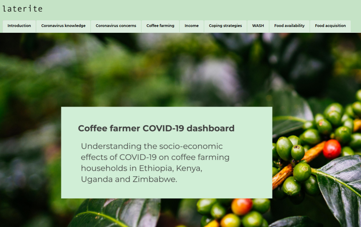
We recently developed an R-Shiny dashboard to share the results from our multi-round phone surveys with TechnoServe on how coffee farmers are dealing with the pandemic in 4 different countries.
Instead of a long report detailing all the findings in each country, we coded a user-friendly website, where anyone can explore the data at their own pace. It took some time and effort, but we believe the results were worth it – because if research is carried out and no one has the time to read it, how useful is it?
As a rule of thumb, R-Shiny dashboards provide the most value when you wish to share information on your survey results across very different audiences, especially when reaching these different groups of interest would be hard to achieve using a different medium.
To ensure quality, dashboards should only draw on clean datasets where data collection mistakes have been addressed. In practice, this implies a lot of coordination between the teams that collect and clean the data, and the team that builds the dashboard.
How to build an R-Shiny dashboard
Preliminary thinking
The brainstorming stage, before dashboard coding begins, is where the most important features should be discussed and planned. We recommend spending as much time as necessary on this initial planning phase. The clearer the picture you create before coding, the easier it will be to put those ideas into practice. Features to think about in this stage include:
- Which outcomes to focus on. Surveys usually include a lot of variables, and adding all of them would make the dashboard confusing. It’s worth spending time to decide which variables should be prioritized in the coding and how those will influence the structure and “narrative” of the dashboard. Ask yourself: which sequence of outcomes will tell a story that makes the most sense to my user? How can we order or group the outcomes of interest in a way that is the most intuitive for the user? In addition to these variables, we always find it useful to also display some general information about the survey including: number of respondents, a map of surveyed locations, and so on.
- What interactivity to include. The interactive component of dashboards makes them engaging and user-friendly, but also raises some questions about how to organize the available toggles. For example, the user could use a toggle to select a location, allowing them to see how a variable evolves over time in that location. Or the user could select the survey round and see how a variable or outcome changes in different locations in each round. Different choices will work for different use cases, but these choices should be made before you start coding.
For the dashboard that we developed for the TechnoServe project, we selected several indicators that illustrated how coffee farmers were impacted by the COVID-19 pandemic. We divided the indicators across eight themes of interest. We then provided toggles on each page to allow the user to choose to view the results by country, round of data collection and country location. While this is just one of the ways we could have structured the dashboard, we hope our choices provide some insight on the decisions we needed to make before we started coding.
The coffee farmer COVID-19 dashboard shows indicators across eight themes of interest
Coding
UI and server elements
R-Shiny dashboard code is divided into two categories: User Interface (UI) elements and Server elements. UI elements determine the appearance of your dashboard while the Server elements determine how your dashboard will respond to user input. R-Shiny dashboards create user interactivity through the coder’s instructions for how the UI elements and Server elements should react to each other in response to user input.
Within the server elements we used ‘reactive code’, which is like giving the Shiny application a recipe to organize the input. For example, reactive code tells the Shiny App that in this location on the page a graph should be displayed with variable A from dataset B if the user selects variable A and country B. We provided instructions like these for all possible user input. This allowed us to create toggles for our variables of interest. The next step in coding a Shiny dashboard is selecting the kinds of graphs or plots to display for each of the variables.
Graphs
While deciding which visualizations to include it is crucial to think of your audience. It is always a good idea to include variation, to avoid making the content monotonous and hard to digest. For the TechnoServe dashboard, we achieved this by selecting a different visualization for each variable type. For example, we displayed single-select variables (e.g., a yes/no question in a single round) on a “semi-donut”, while variables with select-multiple choices (i.e., “select all that apply”) were shown on a bar graph.
When it comes to how to code visualizations in R the considerations are usually technical, but as a general rule when choosing the appropriate R package and display options user-friendliness should be the priority. It is always better to concentrate on features that make the graph easier to understand for the user of the dashboard.
TL;DR
When you are coding an R-Shiny dashboard, spend most of your time planning, be patient and always think of your user.
Happy coding!
This blog was written by Mico Rudasingwa and Pietro Franchi, Research Analysts in Laterite’s Rwanda and Uganda offices.