
For many organizations involved in primary data collection, most medium to large projects mean deploying teams of dozens of enumerators in different locations quite far apart from each other and often in quite remote areas with poor phone network and limited or no access to the internet.
What could possibly go wrong, right? Quite a few things, for example:
- If a question is skipped for 80% of the respondents,
- If an enumerator decides it’s ok to stay at home and fill in the surveys themselves,
- If respondents for a certain enumerator seem to give always the same answer, while the others don’t.
Most of these issues can go unnoticed until the team is back from the field and the analysis starts, i.e., when it’s too late to address the problems. How, then, do you ensure the quality of data while the data is being collected?
One way is to have a supervisor essentially spending the whole day with a small team of enumerators. However, this is not cost effective and even then, the supervisor can’t sit in on every single survey interview. A better solution is to establish a robust data monitoring system to enable the project team to assess the quality of incoming data in real time.
What is data monitoring?
To ensure high quality of data, we need to monitor the quality of data as it comes in on a regular basis. This is valid for all different stages of a project i.e., listing, pilot and/or the main data collection exercise. Monitoring requirements may vary according to the project and its specific needs, but the essence is to have in place some form of data visualization tool to:
- Check survey completion status for each unit of data collection (e.g., household, school) and/or other sub-units of data collection (e.g., number of household members, number of teachers in a school).
- Track enumerator performance on a regular basis. We compare daily quotas by enumerator and if there are outliers on either end of the scale, we can quickly follow up by checking the quality of data (highest percentile) and/or any issues an enumerator may have encountered (lowest percentile).
- Track data collection progress by looking at daily completion statistics vs target quotas in the field plan.
- Visualize distributions for certain variables of interest and be able to compare it vs expectations pre-data collection.
- Track completion status by location say district, sector and/or any other administrative unit that we designate at the start of the data collection exercise.
- Tabulate variables of interest to visualize disaggregation say by gender, education status, rural-urban divide.
- Check for outliers for variables like duration to flag potential data quality issues.
Why Google sheets?
Monitoring the quality of incoming data can be done using several tools either in real time or at regular intervals during the course of data collection.
At Laterite our go-to tool is Google sheets dashboards. We use Survey CTO’s in-built functionality that allows users to publish data directly from their server to a Google sheet.
Google sheets dashboards are ideal for most of our data visualization because of they are:
- user-friendly for our team and our clients.
- cost-effective as SurveyCTO doesn’t charge an extra cost for this functionality.
- And, they allow anyone with access can look at data as it comes in, in real time!
Here is an example, adapted from one of our projects.
Use case: Dashboards at work
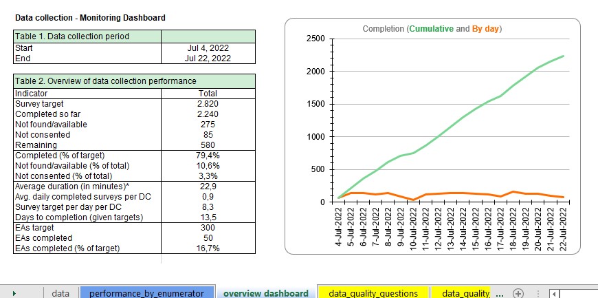
In mid-2022, we conducted a Public Health study in East Africa where our team interviewed caregiver and child pairs in a select number of households. The survey consisted of 3 instruments for the caregiver and 2 for the child, for a total of 5 per household. As part of the field protocol, the enumerators used a google sheet to manually log the number of completed surveys per household per day. This was compared against the completion statistics generated automatically from data that was uploaded to Laterite’s Survey CTO server and fed into the monitoring dashboard.
As part of our quality assurance processes, we compared both sets of information (manual log and automated dashboard) and we realized that some caregiver interviews had not been conducted, yet the field teams had reported those households as completed.
In a few cases, we had to drop the households from the sample altogether during data cleaning as the crucial caregiver surveys had not been completed. But thanks to real-time monitoring, we spotted the problem whilst the team was still deployed in that same geographical location, and the issue was solved by sending the team back to these households and complete the missing interviews.
More information
Check out SurveyCTO’s documentation on publishing to Google sheets
This blog post was written by Denis Kamugisha, Data Quality Manager at Laterite Rwanda.